Validate to XHTML 1.0 Transitional, CSS 2.1, ActionScript 3 standards.
Producing a website that will have valid code will make sure the website is aesthetically consistant throughout cross-platforms and browsers. Also reducing the usablity errors that are already an issue with Flash. Using W3C's online validation service to constantly check and resure that I have valid code.
Creating a portfolio to professional standards.
Making sure that if my portfolio would not look out of place if it was put on a page with other experienced website designers. Meeting the standards set out in my first goal to ensure this will be the case with my final design. A website that lets the work do the talking, rather than trying to be all singing and dancing itself.
Top 3 placement in search enginges.
Because there is already some famous Andrew Whelan's such as the comedy writer, it will be productive for me to get as high as possible so I'm not just lost in the search and relegated to the latter pages. This will require some research into SEO (Search Engine Optimisation) to enable me to put in the right processes to project me to the higher figures.
Flexible and Easily Accessible Website.
I will create a sitemap to make sure no information is more than 2 clicks away from each other, hopefully helping me through the presentation process having all the information on hand to me quickly. The flexibility means that updating it with new work will be a quick and simple job.
Tuesday, 3 February 2009

Last Semester.
The last semester is here and it’s come around quite quick, only yesterday it seems like we were doing team building tasks and dropping eggs from windows. It’s really dawning on me that soon we are going to projected out into the big wide world of discovery to find out how our talents actually rank in the industry amongst professionals and possible employers. Will what we have been taught be enough to secure jobs? Will the experience some people in the class have been gaining throughout the course with side-jobs and projects help towards the final goal of actually working for a professional design company. I’ve thought along the course that many people would not be able to find an industry job, but the people are really starting to show what they are made of. Though before I was really looking at the visual side of it, a lot of members are becoming very good coders and are hungry to learn more of that site; hopefully this will put them forward to where they want to be.
Looking at the last few assignments I’m concentrating on the ones now and leaving the thinking about the final major project some what out of my head. I think my motivation is been something that has consistently come into question with the assignments and hopefully I will be able to show a different side now we’re coming to the close of the course. Never mind proving other members of my class wrong, I think I need to prove to my self that I can actually do great things when I put my mind to it, instead of really resting on my laurels and thinking it will be okay to do this to get through. The Self Managed Learning Plan will be the main way to show this, showing that I can be self motivated with the creation of short term goals and keeping on top of deadlines and to a good quality.
The portfolio assignment is quite interesting, for as long as I can remember I’ve always been messing around with possible portfolios; doing designs and re-doing them 2 days later. In some ways I’m really my own worst critic and find it hard to constantly like the work I produce, forever changing and adding bits to suit my ever evolving outset. Now I know focus is needed to produce something that will not only please me, but the target audience too and the marker. To qualities that they haven’t seen me work before, I’ve always felt this was an assignment I’d really be able to shine in and hopefully this will be the case now we’re finally getting down to doing it. The structuring it to a presentational basis will be a nice mini-challenge also, knowing how it looks on a smart board and making sure all the information will be easy to access and succinct. But I feel I’m up to this task and have a thorough grasp of presentational techniques to compliment the graphical side of the portfolio task.
Word Count [509]
Looking at the last few assignments I’m concentrating on the ones now and leaving the thinking about the final major project some what out of my head. I think my motivation is been something that has consistently come into question with the assignments and hopefully I will be able to show a different side now we’re coming to the close of the course. Never mind proving other members of my class wrong, I think I need to prove to my self that I can actually do great things when I put my mind to it, instead of really resting on my laurels and thinking it will be okay to do this to get through. The Self Managed Learning Plan will be the main way to show this, showing that I can be self motivated with the creation of short term goals and keeping on top of deadlines and to a good quality.
The portfolio assignment is quite interesting, for as long as I can remember I’ve always been messing around with possible portfolios; doing designs and re-doing them 2 days later. In some ways I’m really my own worst critic and find it hard to constantly like the work I produce, forever changing and adding bits to suit my ever evolving outset. Now I know focus is needed to produce something that will not only please me, but the target audience too and the marker. To qualities that they haven’t seen me work before, I’ve always felt this was an assignment I’d really be able to shine in and hopefully this will be the case now we’re finally getting down to doing it. The structuring it to a presentational basis will be a nice mini-challenge also, knowing how it looks on a smart board and making sure all the information will be easy to access and succinct. But I feel I’m up to this task and have a thorough grasp of presentational techniques to compliment the graphical side of the portfolio task.
Word Count [509]
Monday, 12 January 2009
10 Resources
http://www.kirupa.com/developer/flash/index.htm
This website has hundreds of tutorials, ranging from basic flash tuts to dealing with the server-side of flash.
http://www.gotoandlearn.com/
There is a lot of video tutorials on here and deals with the actionscript side of things as well as flash work.
http://www.adobe.com/devnet/flash/
A community to get tips and feedback on your work, has loads of tutorials for every problem you could find using flash.
http://www.flashkit.com/
Also a community with hundreds of resources and people willing to help out when you need it. Great tutorials and fast advice.
http://www.actionscript.org
Dealing with the actionscript side mainly, it shows you how to streamline your work and gives you tips and hints for your building process.
http://www.pixel2life.com/tutorials/adobe_flash/
Probably the site that has the most amount of resources, literally anything you want can be found here, with multiple ways to do it.
http://www.flashperfection.com/
Bringing tutorials from various sites to put together a staggering range and depth of tricks, tips and hints for flash users.
http://as3.metah.ch/
I think the most module and class structured resource I've found, it really breaks everything down for you and puts it in an easily readable language.
http://tutorialoutpost.com/tutorials/flash/actionscript
Hundreds of tutorials dedicated to flash users and really focusing on the input of actionscript alongside.
http://flashspeaksactionscript.com/begin-learning-flash-in-a-flash/
Probably the place I'm going to look at first when it comes to the assignment, it's very easily usable for the novice user.
This website has hundreds of tutorials, ranging from basic flash tuts to dealing with the server-side of flash.
http://www.gotoandlearn.com/
There is a lot of video tutorials on here and deals with the actionscript side of things as well as flash work.
http://www.adobe.com/devnet/flash/
A community to get tips and feedback on your work, has loads of tutorials for every problem you could find using flash.
http://www.flashkit.com/
Also a community with hundreds of resources and people willing to help out when you need it. Great tutorials and fast advice.
http://www.actionscript.org
Dealing with the actionscript side mainly, it shows you how to streamline your work and gives you tips and hints for your building process.
http://www.pixel2life.com/tutorials/adobe_flash/
Probably the site that has the most amount of resources, literally anything you want can be found here, with multiple ways to do it.
http://www.flashperfection.com/
Bringing tutorials from various sites to put together a staggering range and depth of tricks, tips and hints for flash users.
http://as3.metah.ch/
I think the most module and class structured resource I've found, it really breaks everything down for you and puts it in an easily readable language.
http://tutorialoutpost.com/tutorials/flash/actionscript
Hundreds of tutorials dedicated to flash users and really focusing on the input of actionscript alongside.
http://flashspeaksactionscript.com/begin-learning-flash-in-a-flash/
Probably the place I'm going to look at first when it comes to the assignment, it's very easily usable for the novice user.
Wednesday, 10 December 2008
Flash in the Pan
The way I see the industry going, when looking around at various high-end sites and at the design top 40's is with Flash. Everyday it's becoming more and more usable and inturn the age old arguement of 'usability' problems is starting to be obsolete, forward movements in not only the browser technologies ability to handle a wider and more advanced range of code. The ability to create interactive experiences that the client/user takes part in, offering great feedback and the knowledge they want is definitely the way forward.
The best customer service is to go beyond what the customer expects of you. Exactly what Flash enables you to do, a person goes there expecting a simple site, but instead you give them an experience. Something to remember. This encourages a return visit, having this interactive process means that no two visits have to be the same melodic plod along to the information.People are always impressed with a well built Flash website, it gives out more of a wow factor than the generic CSS/HTML based interface of old. Now it's become a talking point, encouraging family and friends to enjoy this experience aswell.
It's something I want to learn and have always wanted to learn but never really had the chance to get into it seriously. For this reason and what I know the outcomes can look like I know I'll enjoy getting to grips with Flash, learning how everything works in conjunction with Action Script to produce that wow factor I've always been looking for. Not only that, it suits my design style so much.. I see myself as quite a minimalistic, conceptual designer. That goes for more of a stylistic aesthetic rather than obvious lording of my design talents. Flash with Action Script matches the way I work so much, offering the capability to turn the minimalistic into an experience.
The best customer service is to go beyond what the customer expects of you. Exactly what Flash enables you to do, a person goes there expecting a simple site, but instead you give them an experience. Something to remember. This encourages a return visit, having this interactive process means that no two visits have to be the same melodic plod along to the information.People are always impressed with a well built Flash website, it gives out more of a wow factor than the generic CSS/HTML based interface of old. Now it's become a talking point, encouraging family and friends to enjoy this experience aswell.
It's something I want to learn and have always wanted to learn but never really had the chance to get into it seriously. For this reason and what I know the outcomes can look like I know I'll enjoy getting to grips with Flash, learning how everything works in conjunction with Action Script to produce that wow factor I've always been looking for. Not only that, it suits my design style so much.. I see myself as quite a minimalistic, conceptual designer. That goes for more of a stylistic aesthetic rather than obvious lording of my design talents. Flash with Action Script matches the way I work so much, offering the capability to turn the minimalistic into an experience.
Wednesday, 3 December 2008
Jog to Christmas
I'm quite happy with how the course has gone by so far in it's 2nd year, I've discovered a never thought ability of being able to efficiently time manage. Which is something I've always struggled with, especially when it was taken on by such precedence in the 1st year. That and organization has never been my winning skill, sometimes I find it a barrier that holds back my creativity, though with the new 'Time Log' I've been using with the team project it's helped a great deal.
Instead of having to stop and record what I'm doing all the time.. I just let a full day flow out and then at the end assess how the day has gone and look at what I've done and how long it took me. I think this mixed with a small schedule is the method that suits me best. Starting the day off knowing exactly what I'm going to do, but knowing I could do each bit at any time and I'm not restricted to filling out a time sheet every time I switch from project to project.
It's something I did consciously work on, but not so much as to sit down and work all the fine details out. It's mainly been something that I've needed to get what has been needed done and organize it in a way I know what to do when. With a small help from Tom giving my a kick up the bum when deadlines are looming.. I've really been able to use it and pickup this skill I can carry on with.
Also has the 2nd year has developed, I've really refined my presentational skills and become a lot more confident when standing up there. This gives me the ability to project what I need to say properly and produce good presentations that can connect with the audience. I think a few things have been essential to this, the first of these is preparation.. I think maybe that's the biggest thing. If you are not prepared for the presentation you won't come across as confident because you don't know exactly what's going be said. Knowing your subject matter enables you to be comfortable and stop the nerves creeping in.
The 2nd of these is practice, with could be said as part of prepare, but it's nice to really highlight the need for practice. Going through it definitely helps you prepare, helping you iron out bits of the presentation you don't want to go in, this was very obvious in mine and Tom's practice presentation to Steve and the rest of our group. But because we had that practice and then another 'attempt/practice' the final one managed to come out great and we ended up landing the pitch.
I've really grown in myself over this past year so far, I'm now more mature and ready to handle the pressures of work. My core design skills have been more refined due to the more inspiration I'm having to find has part of A1 again. Confidence has soared recently and I'm happy with the way things are going.
Instead of having to stop and record what I'm doing all the time.. I just let a full day flow out and then at the end assess how the day has gone and look at what I've done and how long it took me. I think this mixed with a small schedule is the method that suits me best. Starting the day off knowing exactly what I'm going to do, but knowing I could do each bit at any time and I'm not restricted to filling out a time sheet every time I switch from project to project.
It's something I did consciously work on, but not so much as to sit down and work all the fine details out. It's mainly been something that I've needed to get what has been needed done and organize it in a way I know what to do when. With a small help from Tom giving my a kick up the bum when deadlines are looming.. I've really been able to use it and pickup this skill I can carry on with.
Also has the 2nd year has developed, I've really refined my presentational skills and become a lot more confident when standing up there. This gives me the ability to project what I need to say properly and produce good presentations that can connect with the audience. I think a few things have been essential to this, the first of these is preparation.. I think maybe that's the biggest thing. If you are not prepared for the presentation you won't come across as confident because you don't know exactly what's going be said. Knowing your subject matter enables you to be comfortable and stop the nerves creeping in.
The 2nd of these is practice, with could be said as part of prepare, but it's nice to really highlight the need for practice. Going through it definitely helps you prepare, helping you iron out bits of the presentation you don't want to go in, this was very obvious in mine and Tom's practice presentation to Steve and the rest of our group. But because we had that practice and then another 'attempt/practice' the final one managed to come out great and we ended up landing the pitch.
I've really grown in myself over this past year so far, I'm now more mature and ready to handle the pressures of work. My core design skills have been more refined due to the more inspiration I'm having to find has part of A1 again. Confidence has soared recently and I'm happy with the way things are going.
Wednesday, 5 November 2008
Soft Skills.
Throughout this course we've unconciously learned skills that will see us throughout life, namely called 'Soft Skills'; these are skills used frequently and usually occur without us knowing. Simple things like teamwork and communication that can be taken from this course and used in the real world. Taking part in other activities such as football, the skills learned can be displaced and make a person be able to talk to his fellow teammates easier and also work better as part of the team. These are generic life lessons that will follow us around forever.
I've personally learned a lot about humility and trying to be positive when speaking to colleagues around me, helping them along to get to the place they want to be in. Though I still try and give my feedback as bluntly as I ever did, I now see the worth in a balanced approach... helping my points to sink in further and really make a difference.
Presentations were never something I've been worried about in my life, I feel the confidence is there to produce a 'performance' or 'pitch' enabling me to successfully put forward my opinions and findings alone. This course has helped me streamline this, by pointing out things I needed to work on... such as walking around too much and touching my face a lot during presentations. Hopefully meaning I'll be able to communicate the objective of my presentation far in advance of my previous ability.
With the completion of this course there will be the elation of a long-term goal reached. Giving me the confidence to persue things knowing I've got a good understanding of the hardwork and dedication it takes to get there. Experience counts a lot in the industry, not just with design, but with the work ethic that needs to come alongside it, enabling me to the be the best I can... and in the end making myself a more employable person to a possible client or boss.
I've personally learned a lot about humility and trying to be positive when speaking to colleagues around me, helping them along to get to the place they want to be in. Though I still try and give my feedback as bluntly as I ever did, I now see the worth in a balanced approach... helping my points to sink in further and really make a difference.
Presentations were never something I've been worried about in my life, I feel the confidence is there to produce a 'performance' or 'pitch' enabling me to successfully put forward my opinions and findings alone. This course has helped me streamline this, by pointing out things I needed to work on... such as walking around too much and touching my face a lot during presentations. Hopefully meaning I'll be able to communicate the objective of my presentation far in advance of my previous ability.
With the completion of this course there will be the elation of a long-term goal reached. Giving me the confidence to persue things knowing I've got a good understanding of the hardwork and dedication it takes to get there. Experience counts a lot in the industry, not just with design, but with the work ethic that needs to come alongside it, enabling me to the be the best I can... and in the end making myself a more employable person to a possible client or boss.
Wednesday, 8 October 2008
The, Designer.
http://www.creativepool.co.uk/employee/jobdetail.php?ref=DES/EN683/JN312
"Global beauty brand is looking for a graphic designer to join their busy studio. Working on a number of sub brands across all forms of print media - packaging, POS, Promotional, marketing and advertising you will be responsible for projects from concept through to print. You will need to possess excellent client facing skills as the designers have autonomous roles liaising with their internal clients and marketing professionals. Successful candidates will be able to demonstrate a creative flair in their folio especially on the lifestyle and cosmetics/beauty brands."
It's working with print design, something I'm really looking to go into a lot more than 'the web' side. Their design studio is located in Centeral London, a place where I think creativity thrives.. offering the bigger range for client contacts, a heavier stream of competition and higher demands placed on the employee. Pushing you further and further, striving for the excellence that surviving in this highly motivated industry requires. And there's no truer place in the 'Design World' than the 'Fashion Universe'. Therefore I expect to be dealing with big fashion brand name clients, leading me further down the path of my ultimate goal, which is high end design.
There are things I'd need to be really familiar with, if I was to be very serious about the job possession; processes and skills that I don't have much experience with right now. This would be working with different textures and inks to produce a certain finish, right now most of my work has been web/digitally based.. and this move towards print would mean an adventure in learning.
It would also mean be building up my portfolio with more examples of “fashionista” work and packaging examples, showing that I could adequately produce work at high end fashion standard, consistently. Having some expejavascript:void(0)rience with actual Marketing would be crucial too, the 2 year Advertising course at Leeds College of Art & Design would enable me to move onto this new pasture in design.
"Global beauty brand is looking for a graphic designer to join their busy studio. Working on a number of sub brands across all forms of print media - packaging, POS, Promotional, marketing and advertising you will be responsible for projects from concept through to print. You will need to possess excellent client facing skills as the designers have autonomous roles liaising with their internal clients and marketing professionals. Successful candidates will be able to demonstrate a creative flair in their folio especially on the lifestyle and cosmetics/beauty brands."
It's working with print design, something I'm really looking to go into a lot more than 'the web' side. Their design studio is located in Centeral London, a place where I think creativity thrives.. offering the bigger range for client contacts, a heavier stream of competition and higher demands placed on the employee. Pushing you further and further, striving for the excellence that surviving in this highly motivated industry requires. And there's no truer place in the 'Design World' than the 'Fashion Universe'. Therefore I expect to be dealing with big fashion brand name clients, leading me further down the path of my ultimate goal, which is high end design.
There are things I'd need to be really familiar with, if I was to be very serious about the job possession; processes and skills that I don't have much experience with right now. This would be working with different textures and inks to produce a certain finish, right now most of my work has been web/digitally based.. and this move towards print would mean an adventure in learning.
It would also mean be building up my portfolio with more examples of “fashionista” work and packaging examples, showing that I could adequately produce work at high end fashion standard, consistently. Having some expejavascript:void(0)rience with actual Marketing would be crucial too, the 2 year Advertising course at Leeds College of Art & Design would enable me to move onto this new pasture in design.
Tuesday, 7 October 2008
A Structured Cloud.
The last year was really an adjustment year for me, really stepping up to a more business like pace.. hopefully leading towards showing and getting me comfortable with full industry speed. Which already has started happening in 2 year. My real overall aim with this course has been to sharpen my design skills and give me a firm grasp of the coding side, enabling me to create anything I would want to, how I want to. For this reason I've been glad the first assignment has been CSS, I've been eager over the years to get into the development side a lot more, using CSS, PHP, Javascript. The main reason being because it makes me more employable. And since I'm passionate about the Design sides, I feel developer is just another notch on the resume.
Which brings me to next year's aspirations, hoping to have a place on the Huddersfield Multimedia course. I'm choosing this because it'll give me a wider range of skills and abilities, hoping to have a notch over my competition on employability factors. At Huddersfield they teach 3D modelling and animation, something I've dabbled with in the past and something I'd like to really get into. It would enable me to take simple graphics to a whole new level, giving me that edge over the thousands of freelance designers out there.
In the long term future I'd hope to work for a large (in client) niche design company, a bit like The Design Republic. Hopefully with like minded people with similar abilities and could be part of pushing the boundaries of design.. right now I'm sticking within them for the firm skill foundations. One day maybe even free lance.
Which brings me to next year's aspirations, hoping to have a place on the Huddersfield Multimedia course. I'm choosing this because it'll give me a wider range of skills and abilities, hoping to have a notch over my competition on employability factors. At Huddersfield they teach 3D modelling and animation, something I've dabbled with in the past and something I'd like to really get into. It would enable me to take simple graphics to a whole new level, giving me that edge over the thousands of freelance designers out there.
In the long term future I'd hope to work for a large (in client) niche design company, a bit like The Design Republic. Hopefully with like minded people with similar abilities and could be part of pushing the boundaries of design.. right now I'm sticking within them for the firm skill foundations. One day maybe even free lance.
Tuesday, 13 May 2008
Ending Evalution
Initially when applying for this course I had the misconceptions of being immersed in an arty world of creativity, days out in the parks and industrial landscapes; armed with a sketchbook looking for inspiration. Voyages to unparalleled worlds of electronic beams of light and techno images, which the weirdest of ways relates to the last project, my previous ideas came to be; though more towards the end of the course than the beginning. Constantly throughout the assignments having to jump threw over these academic hurdles, which made me realise my previous thoughts before starting, really were a misconception.
Our first assignment helped me adjust to the pace of higher learning, before this course 6 form had been a slow drag towards deadlines, with no velocity for work at all. Where as here the volume needed-mixed with the time length allowed really told me this was another level; the name higher learning does have the Ronsil effect and is a clear step-up from A-level and college courses. I initially started like a bat out of hell, researching, designing and generally doing everything that made me ignore one crucial lesson I needed to learn early, to be successful on this course and in the industry. This was the importance of time planning, with the necessary time sheets to produce every week; your time actually had to be properly planned out and thought about. Given that I had never done anything like this before, it really took some time to adjust. Halfway through the first assignment I saw the real benefits, after my initial zooming off with getting all the work done, I had looked around and saw that know one else was at my current stage; knowing this I really slackened off thinking that I could take somewhat of a breather. This was soon proved as being the wrong thing to do, as when looking around I saw the majority of people had not only caught up with me, but overtaken where I was currently at. Now in the rush to get myself back up to par, I let the quality of my work slip and the time sheets had really been thrown out of the window, by such a rollercoaster ride throughout the first assignment. Frankly this was the main reason for not passing the first assignment, but in this I did learn the lesson of proper time management helps the quality of your work and also helps you to explore your priorities a bit more when decided when and where to do things along the way.
With this in mind, I started the next assignment with the death of the first one hanging over me as referral work needed to be done and focused on; which made doing this current one hard… having to go threw tutorials that I wouldn’t need until a few weeks time. I was eager to get on with this work there and then. Though because the first assignment was a website plan too it helped everyone cut a few corners that they’d learnt previously, but still the intensity had been heightened and we’d stepped up another level to what our production would continue you at throughout the year. This meant adjusting again and with the referral work still in the background, I found it hard to juggle both… this is really where my referral rut started to take shape. I saw myself focusing too much on the design work, and not paying enough attention to the real ground work that needed to be done so I could do this design work more effectively and too a higher level; this was another lesson I’ve learned throughout my time so far on this course. You can’t run without laying solid foundations to run on.
Going hand-in-hand with the A3 assignment was Image Rights, one that required you to do a lot more graphical tasks along the way; personally this made me happy as obviously I’d really say that is my forte when it comes to the overall task of ‘Website Design’. Within the A4 assignment was the creation of banners for the Jazz artist, the first real graphic thing we’d done throughout the course and up to this point probably the most enjoyable. I really enjoyed the timed part of it where we had to sit down and do all the developmental work in such a short amount of time. It helped me get a real feel for the industry pace. I think this is where I started to shine some what, hoping that the graphic talent I had gathered of the years was able to be showcased throughout this assignment. Which all culminated recently when I was told, if I had not referred the assignment due to my Image Restoration work not being up the level of my other work I’d of nearly reached merit or actually reached the merit criteria for this assignment. Though still laying in this referral rut and finding it hard to get out, trying to focus on 3 assignments this time and also time manage all this effectively was pretty hard going at times. I know from the real rush towards the end of this assignment to complete that all 3 at the same time really effected how I worked on them and how I was able to divide my time between them.
Now finally onto the building of the website, I was eager to get started; get one with the actually website and get something up and running online, but due to my referral rut I was stuck doing A3 work until I finally had it perfect and was able to get on with my design. Frustration set in as I started going ahead with the online design without the final word from Steve to say I could actually do the design how I wanted, and that he was happy with it. Though finally I managed to get the original work passed and sorted so I could move along with the Website work, and due to my earlier progress I had a bit of a jump start on this and was able to get along quite quickly. No huge problems ever really occurred throughout the building of the website stage, and the design I had finally worked out suited the target audience and everything fit together nicely. Recently during the referral work for this assignment, I managed to streamline the site a whole lot more and really make it something that was user friendly and manageable with the good addition of lightbox; and also the taking away of a useless diverting page. Helping the user’s to get to the information they wanted a lot more easily.
Having ‘Revert to Type’ alongside the Builder helped me a lot, when it came to me getting overly frustrated when building the website, I was able to settle back with some design work for the A6 assignment, whether it was the presentation or the timed tasks. I think this was one of the main enjoyments for me during this assignment; it helped me fathom some real ideas about the pace set when actually in the industry and also the developmental process that had to be done so quick, you needed to be on top form all the time. Not only this, it also give me some ways to explore mediums of design that I’d never really dabbled in before, such as newspaper articles and even so much as product specific designs for the paint tubes we had been given. During the A6 assignment there was the under lying presentation looming, well I only say looming in retrospect because up until this point I had been comfortable with doing presentations and was quite confident when it came to my abilities to do them. I think a few factors like not being fully prepared added up to me not performing as well as I previously had done; this mixed with the fact it kept getting built up from the first time and I un-characteristically let the pressure get to me rather too much. I’ve learnt how to prepare in properly in the future and hopefully there will not be a repeat performance of this.
Though out the course developmental work has been mentioned when it comes to the graphical side of your work, I knew this was important but never used it as effectively or to such a large scale as I did when doing the A7 assignment. I really stepped my development game up here, I felt I really needed to show the diverse range and quality of idea’s I could come up with… I tried brainstorming as much as possible just to keep bringing new ideas hoping to improve the quality of the final work I would come up with. This assignment has been my favourite overall and a nice finish to the year, I was very happy with the final CD Digipak produced and it conveyed exactly the message I wanted to, taking elements from the name ‘Gas’ and influencing my whole layout and really being one of the main features of the design. I felt the music was thrusting you into a whole new out of this world dimension, so I knew I wanted to create an environment that was kind of gothic and eerie but at the same time mysterious; hoping that a buyer would be drawn in by the cover wondering what could be behind an intriguing design. Alongside this CD design, was the ‘Emit Records’ logo, I knew something that you wouldn’t see everyday was appropriate. I had a lot of idea’s when it came to the logo and originally wanted to go for something a lot more freeform, to really convey an out of this world feeling something that wasn’t really hitting any limits and could be taken various ways. In the end I went for a logo that used the ‘E’ in an interesting way, to really help get some brand identity to the company and hopefully make this something that people would see and recognise anywhere.
Our first assignment helped me adjust to the pace of higher learning, before this course 6 form had been a slow drag towards deadlines, with no velocity for work at all. Where as here the volume needed-mixed with the time length allowed really told me this was another level; the name higher learning does have the Ronsil effect and is a clear step-up from A-level and college courses. I initially started like a bat out of hell, researching, designing and generally doing everything that made me ignore one crucial lesson I needed to learn early, to be successful on this course and in the industry. This was the importance of time planning, with the necessary time sheets to produce every week; your time actually had to be properly planned out and thought about. Given that I had never done anything like this before, it really took some time to adjust. Halfway through the first assignment I saw the real benefits, after my initial zooming off with getting all the work done, I had looked around and saw that know one else was at my current stage; knowing this I really slackened off thinking that I could take somewhat of a breather. This was soon proved as being the wrong thing to do, as when looking around I saw the majority of people had not only caught up with me, but overtaken where I was currently at. Now in the rush to get myself back up to par, I let the quality of my work slip and the time sheets had really been thrown out of the window, by such a rollercoaster ride throughout the first assignment. Frankly this was the main reason for not passing the first assignment, but in this I did learn the lesson of proper time management helps the quality of your work and also helps you to explore your priorities a bit more when decided when and where to do things along the way.
With this in mind, I started the next assignment with the death of the first one hanging over me as referral work needed to be done and focused on; which made doing this current one hard… having to go threw tutorials that I wouldn’t need until a few weeks time. I was eager to get on with this work there and then. Though because the first assignment was a website plan too it helped everyone cut a few corners that they’d learnt previously, but still the intensity had been heightened and we’d stepped up another level to what our production would continue you at throughout the year. This meant adjusting again and with the referral work still in the background, I found it hard to juggle both… this is really where my referral rut started to take shape. I saw myself focusing too much on the design work, and not paying enough attention to the real ground work that needed to be done so I could do this design work more effectively and too a higher level; this was another lesson I’ve learned throughout my time so far on this course. You can’t run without laying solid foundations to run on.
Going hand-in-hand with the A3 assignment was Image Rights, one that required you to do a lot more graphical tasks along the way; personally this made me happy as obviously I’d really say that is my forte when it comes to the overall task of ‘Website Design’. Within the A4 assignment was the creation of banners for the Jazz artist, the first real graphic thing we’d done throughout the course and up to this point probably the most enjoyable. I really enjoyed the timed part of it where we had to sit down and do all the developmental work in such a short amount of time. It helped me get a real feel for the industry pace. I think this is where I started to shine some what, hoping that the graphic talent I had gathered of the years was able to be showcased throughout this assignment. Which all culminated recently when I was told, if I had not referred the assignment due to my Image Restoration work not being up the level of my other work I’d of nearly reached merit or actually reached the merit criteria for this assignment. Though still laying in this referral rut and finding it hard to get out, trying to focus on 3 assignments this time and also time manage all this effectively was pretty hard going at times. I know from the real rush towards the end of this assignment to complete that all 3 at the same time really effected how I worked on them and how I was able to divide my time between them.
Now finally onto the building of the website, I was eager to get started; get one with the actually website and get something up and running online, but due to my referral rut I was stuck doing A3 work until I finally had it perfect and was able to get on with my design. Frustration set in as I started going ahead with the online design without the final word from Steve to say I could actually do the design how I wanted, and that he was happy with it. Though finally I managed to get the original work passed and sorted so I could move along with the Website work, and due to my earlier progress I had a bit of a jump start on this and was able to get along quite quickly. No huge problems ever really occurred throughout the building of the website stage, and the design I had finally worked out suited the target audience and everything fit together nicely. Recently during the referral work for this assignment, I managed to streamline the site a whole lot more and really make it something that was user friendly and manageable with the good addition of lightbox; and also the taking away of a useless diverting page. Helping the user’s to get to the information they wanted a lot more easily.
Having ‘Revert to Type’ alongside the Builder helped me a lot, when it came to me getting overly frustrated when building the website, I was able to settle back with some design work for the A6 assignment, whether it was the presentation or the timed tasks. I think this was one of the main enjoyments for me during this assignment; it helped me fathom some real ideas about the pace set when actually in the industry and also the developmental process that had to be done so quick, you needed to be on top form all the time. Not only this, it also give me some ways to explore mediums of design that I’d never really dabbled in before, such as newspaper articles and even so much as product specific designs for the paint tubes we had been given. During the A6 assignment there was the under lying presentation looming, well I only say looming in retrospect because up until this point I had been comfortable with doing presentations and was quite confident when it came to my abilities to do them. I think a few factors like not being fully prepared added up to me not performing as well as I previously had done; this mixed with the fact it kept getting built up from the first time and I un-characteristically let the pressure get to me rather too much. I’ve learnt how to prepare in properly in the future and hopefully there will not be a repeat performance of this.
Though out the course developmental work has been mentioned when it comes to the graphical side of your work, I knew this was important but never used it as effectively or to such a large scale as I did when doing the A7 assignment. I really stepped my development game up here, I felt I really needed to show the diverse range and quality of idea’s I could come up with… I tried brainstorming as much as possible just to keep bringing new ideas hoping to improve the quality of the final work I would come up with. This assignment has been my favourite overall and a nice finish to the year, I was very happy with the final CD Digipak produced and it conveyed exactly the message I wanted to, taking elements from the name ‘Gas’ and influencing my whole layout and really being one of the main features of the design. I felt the music was thrusting you into a whole new out of this world dimension, so I knew I wanted to create an environment that was kind of gothic and eerie but at the same time mysterious; hoping that a buyer would be drawn in by the cover wondering what could be behind an intriguing design. Alongside this CD design, was the ‘Emit Records’ logo, I knew something that you wouldn’t see everyday was appropriate. I had a lot of idea’s when it came to the logo and originally wanted to go for something a lot more freeform, to really convey an out of this world feeling something that wasn’t really hitting any limits and could be taken various ways. In the end I went for a logo that used the ‘E’ in an interesting way, to really help get some brand identity to the company and hopefully make this something that people would see and recognise anywhere.
Monday, 12 May 2008

Tuesday, 6 May 2008
Aspirations
This last few days have been such a big few days for me, I think it's the combination of the weather and warmth, it's just brought the real creative side out in me; and I'm so enjoying it while it's here. My juices have been flowing in such a big way, new ideas just falling from everywhere.. not just with a few sources; just everything has added to this storm of creavity. I've definitely been taking advantage of this boost, so much more work in my sketchboook.. today I spent a happy 2-3 hours just sketching new ideas, developing them and seeing the possibilities of where I can take each little nuance to the fullest. I've started throwing these ideas round on Adobe Photoshop and I have to say I'm so happy with the results I've had so far, nothings finished totally yet but I can picture the finished product and am so eager to see how it's going to turn out. I was a little unhappy with the previous CD cover I'd created; though I did think there was enough manipulation and creavity in it thats required for this assignment. And that's always a safe one I can go back to if these don't work out how I hope. But I'm really trying to showcase myself and take this to a new level, a real professional level that you definitely could see on the shelves next to big name artists and not even just blend in; I'm wanting these to stick out from the crowd. Have an emotive effect on a buyer whatever the mood it creates is, just inspire some response and connection from the average person. So when it comes to the music they're ready to explore the boundaries of the ambient enviroments created inside.
I was starting to feel a little burnout before this assignment, and the timing of it was exactly what I needed to get me back on my previous wavelength and direction. Feeling really rejuvenated about everything, hopefully that will show in the work I'm producing again. Even looking on retrospect on the A5 assignment, the concept and everything was there for a great piece of work, but the actual stream-lining and development of it was so no where near the level I could've taken it to. Thanks to some ideas from Steve about the page arrangement and other idea's I could bring into it like lightbox, that helped me push it a little way nearer the level and hopefully to pass level. Kinda made me see things a alot more clearer about the whole concept of a website, get rid of the useless faff and really make your user have the ability to connect with your website; this is what you need to make the user feel like they've full filled their purpose of going there.
Looking forward to the summer assignment and next year I'm so excited, over this summer I'm setting a few short term goals for myself when it comes to my own skills. Remember the phrase 'Skills underpin Abilities', and keep this in mind when learning new things, don't set your goals too high although it's great to be ambitious you have to be realistic at the same time. Ask yourself if you have the ability to learn this particular skill; and if the answer is yes.. go for it. This summer I'm going to make the effort to iron out my personal weaknesses, which mainly has to do with the developing side of everything. I know with some work I could step my coding game up to something where I'm comfortable with it all, though I know this may be a stressful learning curve, I'm willing to go through this to get to exactly where I need to be right now. Get myself ready for this first assignment in year 2, and I previously never thought I'd say this, being my usual stance on the coding side, but 'really get into CSS'. The drive for this is the possibilities open if you have the talent of both sides, developing and designing.. it just makes you such a better prospect for the actual industry and also personal development; I think this willingness to learn and passion for it is what actually takes you to the next level and gets you seriously ready for the industry. I'm hitting this second wind and excited about it.
Look out over the next few days for these final ideas and developed designs to be up for feedback, not only here but on the forum aswell.. and when I catch a few people at ridiculous in the morning times. I think as a class we really need to start getting into some proper feedback in a big way, just think of it as a team of designers and developers with the same goal.. think about how much we can push each other and drive ourselves onto this goal. It'll be so much easier with everyone behind everyone helping, giving the advice and feedback that we need when we need it, and at low points taking people by the ear and pulling them into the right direction.
I was starting to feel a little burnout before this assignment, and the timing of it was exactly what I needed to get me back on my previous wavelength and direction. Feeling really rejuvenated about everything, hopefully that will show in the work I'm producing again. Even looking on retrospect on the A5 assignment, the concept and everything was there for a great piece of work, but the actual stream-lining and development of it was so no where near the level I could've taken it to. Thanks to some ideas from Steve about the page arrangement and other idea's I could bring into it like lightbox, that helped me push it a little way nearer the level and hopefully to pass level. Kinda made me see things a alot more clearer about the whole concept of a website, get rid of the useless faff and really make your user have the ability to connect with your website; this is what you need to make the user feel like they've full filled their purpose of going there.
Looking forward to the summer assignment and next year I'm so excited, over this summer I'm setting a few short term goals for myself when it comes to my own skills. Remember the phrase 'Skills underpin Abilities', and keep this in mind when learning new things, don't set your goals too high although it's great to be ambitious you have to be realistic at the same time. Ask yourself if you have the ability to learn this particular skill; and if the answer is yes.. go for it. This summer I'm going to make the effort to iron out my personal weaknesses, which mainly has to do with the developing side of everything. I know with some work I could step my coding game up to something where I'm comfortable with it all, though I know this may be a stressful learning curve, I'm willing to go through this to get to exactly where I need to be right now. Get myself ready for this first assignment in year 2, and I previously never thought I'd say this, being my usual stance on the coding side, but 'really get into CSS'. The drive for this is the possibilities open if you have the talent of both sides, developing and designing.. it just makes you such a better prospect for the actual industry and also personal development; I think this willingness to learn and passion for it is what actually takes you to the next level and gets you seriously ready for the industry. I'm hitting this second wind and excited about it.
Look out over the next few days for these final ideas and developed designs to be up for feedback, not only here but on the forum aswell.. and when I catch a few people at ridiculous in the morning times. I think as a class we really need to start getting into some proper feedback in a big way, just think of it as a team of designers and developers with the same goal.. think about how much we can push each other and drive ourselves onto this goal. It'll be so much easier with everyone behind everyone helping, giving the advice and feedback that we need when we need it, and at low points taking people by the ear and pulling them into the right direction.
Tuesday, 29 April 2008
Gaseous Outcome.
Closing into the final deadline this week has been a pivotal week in our development and full creation of the assignment tangibles. With the logo already finalised, finished and fully polished off; our total focus fell on the foundations in which the logo mixed with the music and research presented us with. Alongside our earlier work we needed to have our final CD cover idea presented today, not totally finished; but something that would lead and be very similar to the final handed in work. I'd got some really strong ideas and had virtually developed a finished piece with one of them, which I presented in the seminar groups on Tuesday. I feel it got good feedback and people were pleased with the work I did, there wasn't too many complaints when it came to criticism and the ones that cropped up had already been noticed by me and changes planned for the future. Although I still like this design, I don't think it's as good as I could make it or as good as another idea could be produced. I think the composition especially of the pipework is done quite poorly which leads to it not having a great presence in the front cover. Also when looking at it alongside professional CD covers I do not think it would hold its weight very well; just for the simple fact it doesn't jump out of your with any kind of design swagger or smooth graphics; it's a bit plain. This is the main reason for my developing other ideas as much as I have this one, so I can be happy with knowing the final design is the best I could create.
The logo I've developed I feel suits the record label, but not only that I think it really suits the style of my music, originally it looked alot more like a sports logo; but with the recently developed side of it.. I think the logo flows alot more. Symbolising the music and label, with the smooth and clear curves mixed with the sharp points and flat diagonal of the left side, as Emit and it's music it quite a varied range and you never seem to know what your going to get when it comes to the records released.
We're sharply coming to the end of our first year, I think there's a continuous feeling throughout the group that it's so sudden; on reflection at break today over our first day and the activities we did: it really just seems like only yesterday we were talking our introductory walk around Thornes Park and getting to know each other. Over this past year I've seen us really grow as a group and individuals have come together to make it an enjoyable place to learn and design, which is one of the main reasons the year has flown by. Another reason for this is the amount of work we've done over this year, the speed it has really seemed like we've started one assignment then finished it in no time at all. There has always been a lot of work going on at once and the demand asked of us has always been high, so there was no time to flounder around.
Over these next few weeks there won't be a splendid amount of work to do, most of it will be polishing off already worked out ideas and a lot of time spent on the A1 assignment. I think this will be my biggest effort of the year, I know theres alot to do when it comes to A1; especially I've a lot of annotation to do with the inspiration I've been sticking in my sketchbook throughout the year. And also some of the annotations on on developmental work I've done this term, With the added relief of having to stick in loads of previous free sheets, but this part will all be over soon.. eager to look forward to the next year.
The logo I've developed I feel suits the record label, but not only that I think it really suits the style of my music, originally it looked alot more like a sports logo; but with the recently developed side of it.. I think the logo flows alot more. Symbolising the music and label, with the smooth and clear curves mixed with the sharp points and flat diagonal of the left side, as Emit and it's music it quite a varied range and you never seem to know what your going to get when it comes to the records released.
We're sharply coming to the end of our first year, I think there's a continuous feeling throughout the group that it's so sudden; on reflection at break today over our first day and the activities we did: it really just seems like only yesterday we were talking our introductory walk around Thornes Park and getting to know each other. Over this past year I've seen us really grow as a group and individuals have come together to make it an enjoyable place to learn and design, which is one of the main reasons the year has flown by. Another reason for this is the amount of work we've done over this year, the speed it has really seemed like we've started one assignment then finished it in no time at all. There has always been a lot of work going on at once and the demand asked of us has always been high, so there was no time to flounder around.
Over these next few weeks there won't be a splendid amount of work to do, most of it will be polishing off already worked out ideas and a lot of time spent on the A1 assignment. I think this will be my biggest effort of the year, I know theres alot to do when it comes to A1; especially I've a lot of annotation to do with the inspiration I've been sticking in my sketchbook throughout the year. And also some of the annotations on on developmental work I've done this term, With the added relief of having to stick in loads of previous free sheets, but this part will all be over soon.. eager to look forward to the next year.
Tuesday, 22 April 2008
Musically Inclined
Developmental work has a been a big part of my last week, I not only really started to develop my original ideas and previous designs to a better standard but I continued creating even more ideas, through many different mediums. I thought this would help me broaden and expand my range of ideas and give me other elements I could bring into my final design. I also started to sketch to a more accurate standard than I had done before, I felt that with the adding of annotations would really be able to present my developmental ideas and give the marker a lot more of an idea of the actual thing I was going for.
Last week I also finished my final logo which I will upload later, I'm happy with the developmental process that I went through to get to my final design. It shows a clear start to where the idea came from and exactly how I've developed it throughout individual stages, I also showed where I'd tried to use that idea to develop other ways and similar designs based around this initial idea. I previously thought I'd finished my logo, but last week I decided to round the corners on the edges, I just think this made it a lot stronger for the branding and also made my logo relate more to the 'ambient' feel a lot better. Just for the fact it made it abit more natural, I was going by the thought process that my logo before this would of related to a sports maybe surf clothing company a lot more than it would an ambient record label.
I've really been getting along with my CD cover this week, especially when it came to my final design. I set everything up towards the guidelines and started final design work on the concept I had chosen to develop on screen this week. So far it's turned out quite well, I originally went for a floating island in the background idea giving it an eerie effect and hopefully quite space age trying to represent the music on the actual disk. Especially when it had a factory ontop of the island that produced gas, making it kind of a subliminal message towards the person who might buy this record. Then I developed this idea with a planet instead of the floating island thinking that the island might be abit tacky. I now prefer the one with the planet, I've messed around with the factory ontop of the planet; but I think overall just having the planet coming through the smoke gives it a stronger concept and space effect more accurately representing my music.
Last week I also finished my final logo which I will upload later, I'm happy with the developmental process that I went through to get to my final design. It shows a clear start to where the idea came from and exactly how I've developed it throughout individual stages, I also showed where I'd tried to use that idea to develop other ways and similar designs based around this initial idea. I previously thought I'd finished my logo, but last week I decided to round the corners on the edges, I just think this made it a lot stronger for the branding and also made my logo relate more to the 'ambient' feel a lot better. Just for the fact it made it abit more natural, I was going by the thought process that my logo before this would of related to a sports maybe surf clothing company a lot more than it would an ambient record label.
I've really been getting along with my CD cover this week, especially when it came to my final design. I set everything up towards the guidelines and started final design work on the concept I had chosen to develop on screen this week. So far it's turned out quite well, I originally went for a floating island in the background idea giving it an eerie effect and hopefully quite space age trying to represent the music on the actual disk. Especially when it had a factory ontop of the island that produced gas, making it kind of a subliminal message towards the person who might buy this record. Then I developed this idea with a planet instead of the floating island thinking that the island might be abit tacky. I now prefer the one with the planet, I've messed around with the factory ontop of the planet; but I think overall just having the planet coming through the smoke gives it a stronger concept and space effect more accurately representing my music.
Tuesday, 15 April 2008
The Coverage
I've really been focusing on my CD cover over this past week, trying to get some solid ideas down on paper for when I started moving to Adobe Photoshop. Though I did some small developmental work on Photoshop throughout the week, just so I could my brain onto the design path. Since over the years I've seemed to work better straight on the screen, messing around with stuff and seeing what happens. I think this course has changed the way I design, especially with the developmental work; I've started to prefer to design on paper first and get ideas down, develop them to see where an idea can go. It saves alot of time in the final process of designing, so that there arn't millions of wasted final designs that didn't go according to plan, because I didn't know exactly what I was doing until it happened on screen.
As the week progressed I began to gather more and more ideas, especially since I had started properly researching into CD Covers and found loads of inspirational artwork to spur me on. Even just going threw artwork that wasn't really suitable for my particular genre helped me get ideas, I really liked some of the conceptual photography for bands like 'Blur' and their cover 'The Great Escape', covers that really mean something from a metaphorical standpoint.
I've finalised my logo and really worked on the whole concept of it, due to suggestions made by Steve I made the lines going diagonal on the left edge lineup, instead of the 'e' moving straight down. I think this had made my overall logo a lot better flow, giving more structure. This gives me a stronger brand name and company recognition, hopefully making the business more money in the process as people can really recognise the whole company from just the body of this logo. Not only have I finalised the development of my logo, I've also started taking it to next generations and given it subtle effects to just add a little bit of flare and shine. I think this will help finish the logo off just that bit more and hopefully add strength.
This week I'm really going to make my CD covers into something special, start adding some major Photoshop photoshop effects. Try my best to convey the music that's on the album by with lighting effects and warps. But still trying to retain an ery natural feel, something along the sides of an Aphex Twin effect, mixing the electronic and the natural to create a biotech feel. I'm going to see what photographs I can get to manipulate and create this kind of effect.
As the week progressed I began to gather more and more ideas, especially since I had started properly researching into CD Covers and found loads of inspirational artwork to spur me on. Even just going threw artwork that wasn't really suitable for my particular genre helped me get ideas, I really liked some of the conceptual photography for bands like 'Blur' and their cover 'The Great Escape', covers that really mean something from a metaphorical standpoint.
I've finalised my logo and really worked on the whole concept of it, due to suggestions made by Steve I made the lines going diagonal on the left edge lineup, instead of the 'e' moving straight down. I think this had made my overall logo a lot better flow, giving more structure. This gives me a stronger brand name and company recognition, hopefully making the business more money in the process as people can really recognise the whole company from just the body of this logo. Not only have I finalised the development of my logo, I've also started taking it to next generations and given it subtle effects to just add a little bit of flare and shine. I think this will help finish the logo off just that bit more and hopefully add strength.
This week I'm really going to make my CD covers into something special, start adding some major Photoshop photoshop effects. Try my best to convey the music that's on the album by with lighting effects and warps. But still trying to retain an ery natural feel, something along the sides of an Aphex Twin effect, mixing the electronic and the natural to create a biotech feel. I'm going to see what photographs I can get to manipulate and create this kind of effect.
Tuesday, 8 April 2008
Eeee.
This week has been a swamp with the letter e's, as far as the eye could see.. looking around in class means your inundated with logo's, emitting rays of radioactive waste, e's dancing and waving. A whole variety. It's pretty safe to say we as a class have come up with a good range of designs for this logo project, from what I've seen I can see some very solid ones forming in class, and I know that with a little tweakage they could cut the mustard against professional logo's. At the moment I'm fairly happy with the way this project is going, and am enjoying all the sketchbook work, drawing and manipulating; but by the end of the assignment, I'm going to never want to see another 'e' ever again.
I've come up with a few good strong logos, and although personally I would've gone down a different route to the one Steve actually chose out of the ones given to him, I'm pretty happy with the logo I am working with anyway. I think it has all the attributes of a good logo; it fills the space will, there is some real contrast to it, also quite a recognisable shape.. clear brand identity not getting it mixed up with anything else, and also it works at a variety of sizes. It'll be good to see how this logo fits in with my final project of the CD cover, and if I'm going to have to try mirror the style on there or if it'll just all come into place without needing to tweak. I'm hoping the latter, as I think there is a very distinct style to my work in these situations and all kind've follow a similar path from my way of thinking. Really going for a futuristic effect but still being able to be used in the mainstream and recognised, which will give me that vital brand recognition.
This week is the week to start on the CD cover, now I've got some finalisation from Steve on my logo, I can press ahead with the next task. I've already started doing more precise mood boards to convey my feelings around the type of music and how it will be represented on the CD cover its self. Started jotting ideas down, for images on the cover, graphical features I can put in and how everything will be manipulated for the benefit of the aesthetics. I also need to start thinking about what is going to go on the CD its self, really trying to keep a simplistic feel throughout the job, so this shouldn't be such a long task, I just need to get some real solid ideas down on paper and start developing them into great designs, good enough to compete with professional. As this is the aim of this task, hoping that the cover/cd you have designed, can be put in HMV and not look out of place on the shelves.
I have to say I'm pretty confident I can make it to this professional level, I know the design skills, eye are there it's all a matter of the creative side and hoping that the work I come up with will be some of my best. I know throughout this task I'm going to keep striving for better and better, since we've been given so much time to do this. Hopefully the work will actually match my abilty.
Since the talk to John on Monday and the speaker that came in, I'm going to start going out there and looking at jobs; what design companys want from a designer, what skills..etc and also other educational establishments, to see how this compares to what I'm doing at the moment. Then I will be able to see what my rivals and competitors are being taught whilst I'm here, hopefully knowing all this, when it finally comes time to go for a real job I'll have the necessary skills, attitude and foot in the door with my portfolio to be successful. This past year has gone so quick, I can tell the next one will go even quicker; hopefully all this will make me ready for leaving the course and getting out into the big world. As a safety there's other courses at other places, I can use to top up my skills and really persue excellence before going for a job.. the decision will come at the end of the two years, which one my choice will be.
I've come up with a few good strong logos, and although personally I would've gone down a different route to the one Steve actually chose out of the ones given to him, I'm pretty happy with the logo I am working with anyway. I think it has all the attributes of a good logo; it fills the space will, there is some real contrast to it, also quite a recognisable shape.. clear brand identity not getting it mixed up with anything else, and also it works at a variety of sizes. It'll be good to see how this logo fits in with my final project of the CD cover, and if I'm going to have to try mirror the style on there or if it'll just all come into place without needing to tweak. I'm hoping the latter, as I think there is a very distinct style to my work in these situations and all kind've follow a similar path from my way of thinking. Really going for a futuristic effect but still being able to be used in the mainstream and recognised, which will give me that vital brand recognition.
This week is the week to start on the CD cover, now I've got some finalisation from Steve on my logo, I can press ahead with the next task. I've already started doing more precise mood boards to convey my feelings around the type of music and how it will be represented on the CD cover its self. Started jotting ideas down, for images on the cover, graphical features I can put in and how everything will be manipulated for the benefit of the aesthetics. I also need to start thinking about what is going to go on the CD its self, really trying to keep a simplistic feel throughout the job, so this shouldn't be such a long task, I just need to get some real solid ideas down on paper and start developing them into great designs, good enough to compete with professional. As this is the aim of this task, hoping that the cover/cd you have designed, can be put in HMV and not look out of place on the shelves.
I have to say I'm pretty confident I can make it to this professional level, I know the design skills, eye are there it's all a matter of the creative side and hoping that the work I come up with will be some of my best. I know throughout this task I'm going to keep striving for better and better, since we've been given so much time to do this. Hopefully the work will actually match my abilty.
Since the talk to John on Monday and the speaker that came in, I'm going to start going out there and looking at jobs; what design companys want from a designer, what skills..etc and also other educational establishments, to see how this compares to what I'm doing at the moment. Then I will be able to see what my rivals and competitors are being taught whilst I'm here, hopefully knowing all this, when it finally comes time to go for a real job I'll have the necessary skills, attitude and foot in the door with my portfolio to be successful. This past year has gone so quick, I can tell the next one will go even quicker; hopefully all this will make me ready for leaving the course and getting out into the big world. As a safety there's other courses at other places, I can use to top up my skills and really persue excellence before going for a job.. the decision will come at the end of the two years, which one my choice will be.
Tuesday, 1 April 2008
Emitting Pleasure.
When first greeted with the A7 assignment I was really pleased, reading all the tasks we would get to do in the next few weeks; pure design. This is exactly how I thought the majority of the course would be when initially signing up. I'm really starting to come into my element here, I can see the designs flowing through my head, already with strong logo and cd cover ideas. The music it's self is so inspirational, and theres so much to use whether it's just the record label name being 'emit' or plays on the type of music they sell being really electronical. I'm taking influences from sci-fi, website design company's like Shadowness and The Design Republic.
With the first few logo's already done I can really see how they are gonna develop into the final product, I've got visions of expanding light shooting around; galaxies swirling, deep see creatures floating and glowing. I'm also really looking at simplistic ideas, especially when it comes to the CD cover.
With the first few logo's already done I can really see how they are gonna develop into the final product, I've got visions of expanding light shooting around; galaxies swirling, deep see creatures floating and glowing. I'm also really looking at simplistic ideas, especially when it comes to the CD cover.
Tuesday, 11 March 2008
Emitting Inspiration
Today has been a bit of a teaser day, researching into Electronica Labels and other bands also like my chosen 'Gas', and seeing all the artwork created by designers for them. Seeing the logo's and inspirational pieces done around the music, mixed with the pure visionary sounds; really is making me want to push on with the design process. I've already got so many ideas flowing, for both the logo and the CD cover, I've been playing with them; contrasting themes and mixing styles together for the website, as well as the overall branding of the label. I've pretty much got the whole early part of this assignment and the development work already finished in my head, though I know I'll be able to discover even more when it comes to putting things down onto paper for our actual development.
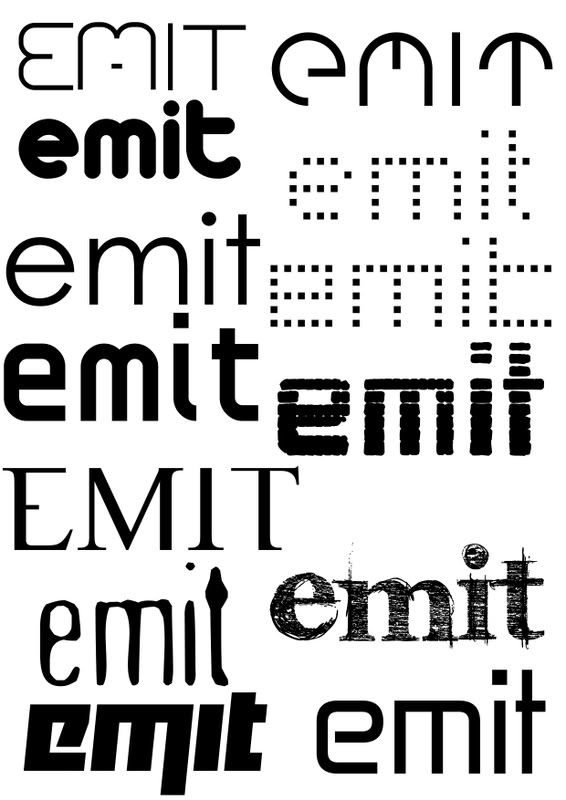
My mood boards really came from these ideas, I had colour schemes for different designs in my head which I proceeded to put into mood board form to see how all the colours work together. See the contrasts they have with each other, which colours are vibrant and pulsating; really trying to mirror the feeling listening to the music gave me. In other words a visual representation of my CD review from yesterday. I also looked at various fonts to go along side my artist and emit and worked some down onto a document, which you will find below this paragraph in a link. These are fonts I really think suit the whole vibe and feel of it, from my perspective; it will be hard narrowing it down to a final 1-2, but I do also have my favourites on the list.
Emit Fonts
I prefer to mood board rather than mind map, it opens my creativity ducts a lot more than simply just writing words down onto paper. Seeing that visual effect the colours and the fonts have in an actual document, then mixing them together to create my desired feeling. I can really see this assignment all coming together. I mentioned it was one I was looking forward to the most to Steve, and I really can't wait to get the go ahead with it. This assignment will really let me use my design skills to their boundaries, then push them beyond the limits and discover new techniques, new ways I'd never really thought of before. I'm hoping to excel with these tasks, I don't think I'm just going to settle for a pass with this one; I need to push this mini-major.
I really enjoyed the CD review yesterday, it did push my creativity in a different direction and working with words in that particular way is something I thoroughly enjoy. Especially as Steve knows, using such a complicated syntax and lexis to convey my ideas to the audience and really try describe exactly what I was feeling and thinking, when listening to the CD. I can't wait to see what the self study work is like.
My mood boards really came from these ideas, I had colour schemes for different designs in my head which I proceeded to put into mood board form to see how all the colours work together. See the contrasts they have with each other, which colours are vibrant and pulsating; really trying to mirror the feeling listening to the music gave me. In other words a visual representation of my CD review from yesterday. I also looked at various fonts to go along side my artist and emit and worked some down onto a document, which you will find below this paragraph in a link. These are fonts I really think suit the whole vibe and feel of it, from my perspective; it will be hard narrowing it down to a final 1-2, but I do also have my favourites on the list.
Emit Fonts
I prefer to mood board rather than mind map, it opens my creativity ducts a lot more than simply just writing words down onto paper. Seeing that visual effect the colours and the fonts have in an actual document, then mixing them together to create my desired feeling. I can really see this assignment all coming together. I mentioned it was one I was looking forward to the most to Steve, and I really can't wait to get the go ahead with it. This assignment will really let me use my design skills to their boundaries, then push them beyond the limits and discover new techniques, new ways I'd never really thought of before. I'm hoping to excel with these tasks, I don't think I'm just going to settle for a pass with this one; I need to push this mini-major.
I really enjoyed the CD review yesterday, it did push my creativity in a different direction and working with words in that particular way is something I thoroughly enjoy. Especially as Steve knows, using such a complicated syntax and lexis to convey my ideas to the audience and really try describe exactly what I was feeling and thinking, when listening to the CD. I can't wait to see what the self study work is like.
Monday, 10 March 2008
Breathe Aload Of Gas..
With Gas, the first thing hitting you is the overwhelming futuristic flavour that greets the eardrums, says hello.. then warps you at light speed to a distant planet. Finding yourself in a world of eclectic sounds, visions of bright pulsating lights whereeverything is backwards; essentially Tokyo on ecstasy. In this case Gas is more like rocket fuel than petrol.
Comparable to well known artist such as Aphex Twin, Gas is more of an experience than a song; giving you memories, rather than a quick catchy chorus. Presenting an environment for outer space beings to thrive, evolving into watts of living sound. And at the heart of this is 'Wolfgang Voigt' manipulating your mind, body and soul.. as the puppet master controlling his own interstellar universe.
My previous perceptions of ambient/electronic have been seismically thrown out the window. With songs like 'Timestretch~Earthloop' and 'Microscopic' laying the strong foundations for the more eclectic structures like 'Experiments' and 'SeOCl2' to burst through the terrafirma and amaze. Wolf's creations constantly feel like you'd never hear the same song, in the same way twice; every synth, every beat is so exposed to its own interpretation.
Gas offers both the novice and seasoned electronica listener a journey, 'eliminating any interruptions or distractions' on a path to an ambient enlightenment. Do you love music? If you answered yes to that question, buy this.
Comparable to well known artist such as Aphex Twin, Gas is more of an experience than a song; giving you memories, rather than a quick catchy chorus. Presenting an environment for outer space beings to thrive, evolving into watts of living sound. And at the heart of this is 'Wolfgang Voigt' manipulating your mind, body and soul.. as the puppet master controlling his own interstellar universe.
My previous perceptions of ambient/electronic have been seismically thrown out the window. With songs like 'Timestretch~Earthloop' and 'Microscopic' laying the strong foundations for the more eclectic structures like 'Experiments' and 'SeOCl2' to burst through the terrafirma and amaze. Wolf's creations constantly feel like you'd never hear the same song, in the same way twice; every synth, every beat is so exposed to its own interpretation.
Gas offers both the novice and seasoned electronica listener a journey, 'eliminating any interruptions or distractions' on a path to an ambient enlightenment. Do you love music? If you answered yes to that question, buy this.
Wednesday, 5 March 2008
A6 - Evaluation
Personal Overall
Out of all the assignments we have done, it’s hard for me to pick between A5 and A6 for the one I’ve enjoyed the most. There has really been different parts of each that appealed to me a lot. With A6 I think it’s been the timed-tasks, working to a set deadline of an hour or so is something I enjoy; the pressure inspires me to produce better work and on deadline. Sometimes I just need that extra push of a pressured deadline to get something done, especially when I tend to do work and re-do work; causing me problems due to the time restrains. With the timed-tasks, you know there’s that looming deadline and there is no way around it. I wish we would’ve had a little bit more freedom with our designs; working solely with Adobe InDesign is a tiresome objective… especially since I’m really used to using Adobe Photoshop for all my design needs.
Which I got to do when it came time to design our presentation and handouts, I remembered to make this a real design task after the first presentation. Again I continued a theme linked from my presentation to my handout, I made it a real classic design to emphasize the kind of fonts Frederic Goudy created. To do this I used Photoshop to make fading lines for breaking up the text and for details in the corners of the presentation and handouts alike. I felt just this small design feature in my work added some real character without taking precedence before the actual content on both; because of course this is the most important thing.
I was a little unhappy when it came to my actual performance in the presentation, it wasn’t really myself as I’m usually quite comfortable in that environment; as I’ve done presentations hundreds of times. I think outside influences distracted me from producing the performance I actually wanted to when it came to the presentation; I unusually froze up and forgot a lot of the information and script I had memorised for that task. Hopefully I’ll be back to my previous level when it comes to doing another presentation in the future, and definitely in regards with the final task of the course, which is to present all the work you’ve done over the whole course.
Hokai
This task was the one I think I enjoyed most out of all the assignments in A6, because it was so small every detail had to be looked at in close proximity. Sometimes I tend to lose focus on the smaller details when it comes to the bigger tasks and make errors that could’ve easily been avoided or corrected. I was also really happy the turn out of my actual design, I feel it emphasized the brand in the right light and would have worked well as an actual design for this type of product. The information a person looking for this kind of paint would need to take light of; was in there clear and could’ve been seen with accuracy by any passer by. Also with the feedback given by my tutor, he was very happy with the product design also and noted that it is a very workable design. This task follows a methodology that I have had throughout this course, keeping it simple but effective. As I really used to over complicate everything I did when it came to design; now I’ve started to break everything down and go for the simple clean effect.
Vodafone
The Vodafone task, was one I’d of really liked to do out of Adobe InDesign. When I first discovered what this task was I thought it was a real good way to present some serious information with a good layout and arty feel, but due to the restrictions of InDesign I don’t think I managed to achieve this. I previously had picture in my head of graphical features all over the piece, but since we were only allowed to work with the tools given to us and the information given on the assignment sheet; I was a little disappointed with my overall outcome. I think with another 10 or so minutes I could’ve turned this into something really good. At this point I hadn’t fully got to grips with the way precise layouts work and the design features you could include, also the time saving aspects of creating these layouts. If I were to do this again I know I’d produce a far better product, after just the amount of experience I’ve had since creating this one.
Jonathan Gee
I really thought I’d enjoy this task, but I found it quite frustrating. The annoyance that captured me during this task was all down to one point, and that was lining my paragraphs up at the bottom. I was quite happy with the rest of my design; I tried something a bit different with the banner leading down towards the text and next to the picture and especially with the pull out quote; which I also carried onto some of the later assignment tasks. After this task I started to do some real research with Adobe InDesign and used it a lot more, giving me a better knowledge of the software; hopefully something that would push me to improve in the future tasks. Due to this annoyance and also not really paying attention to detail, as I had a typo on my pull quote on the word ‘bad’ and it really hindered the overall look of the piece. Having a typographical error in that way, is not professional at all.
Grid
Today’s Grid task was one that I quite enjoyed also, having previously got quite familiar with in Design; I found this fairly easy and with no time at all was able to create exactly the layout with the margins I wanted. A lot of this was due maths during, breaking down the numbers and working out what each individual cell and space so that all my layout was correct and easy to manage. Due to recent experience with such layouts I definitely think this helped me in the completion of this grid, having sampled other grids from various newspapers and also the ones we did on the Jonathan Gee and Vodafone assignments. The small design tasks in this assignment were easy to produce, I really hit on of my detailed roughs on the head; taking inspiration originally from 'The Guardian' newspaper style for the header. Unfortunately they didn't have the exact font I wanted to use; which was a light thickness Helvetica, which would of suited the theme of 'Jazz' but with a real modern and formal twist. Though I finally settled on Century Gothic is a nice compromise as it suited the feel of the font I was originally going to go for.
Story
Due to the grid and everything being set out in the last assignment this was a fairly easy one to take hold off. After a few rough sketches of layouts, followed by some more detailed versions, I managed to get a layout I really liked. It incorporated the picture as well as a good pull out quote to really draw the reader in. Unlike some previous assignments when it came to using the grid I didn't find that many problems, knowing exactly what I wanted and where to put it. I think this planning helped me so well when it came to these final stages of this part of the Grid/Story assignments. I did have a slight problem when it came to the website address running onto another line. But due to the fact I've recently become more fluent in the language of 'Adobe InDesign', I found a good solution for this by making it slightly smaller but bold, so the website address really stood out to you. A part of this assignment I really enjoyed was the creating the headline, I like being creative in all different ways so this was just another outlet. I toyed with various headlines, using wordplay on snake's names, popular films such as 'Snakes on a Soul Plane', even though Jazz isn't exactly Soul. But I was very happy with the one I finally chose.
Improve
Be alot more adventurous when it comes to the actual designs, adding new and unused elements to really push my designing forward. And attain the next level.
Get used to the programs and applications I will be using to do the tasks, alot more first before starting the tasks. Instead of learning them through the process of working.
Out of all the assignments we have done, it’s hard for me to pick between A5 and A6 for the one I’ve enjoyed the most. There has really been different parts of each that appealed to me a lot. With A6 I think it’s been the timed-tasks, working to a set deadline of an hour or so is something I enjoy; the pressure inspires me to produce better work and on deadline. Sometimes I just need that extra push of a pressured deadline to get something done, especially when I tend to do work and re-do work; causing me problems due to the time restrains. With the timed-tasks, you know there’s that looming deadline and there is no way around it. I wish we would’ve had a little bit more freedom with our designs; working solely with Adobe InDesign is a tiresome objective… especially since I’m really used to using Adobe Photoshop for all my design needs.
Which I got to do when it came time to design our presentation and handouts, I remembered to make this a real design task after the first presentation. Again I continued a theme linked from my presentation to my handout, I made it a real classic design to emphasize the kind of fonts Frederic Goudy created. To do this I used Photoshop to make fading lines for breaking up the text and for details in the corners of the presentation and handouts alike. I felt just this small design feature in my work added some real character without taking precedence before the actual content on both; because of course this is the most important thing.
I was a little unhappy when it came to my actual performance in the presentation, it wasn’t really myself as I’m usually quite comfortable in that environment; as I’ve done presentations hundreds of times. I think outside influences distracted me from producing the performance I actually wanted to when it came to the presentation; I unusually froze up and forgot a lot of the information and script I had memorised for that task. Hopefully I’ll be back to my previous level when it comes to doing another presentation in the future, and definitely in regards with the final task of the course, which is to present all the work you’ve done over the whole course.
Hokai
This task was the one I think I enjoyed most out of all the assignments in A6, because it was so small every detail had to be looked at in close proximity. Sometimes I tend to lose focus on the smaller details when it comes to the bigger tasks and make errors that could’ve easily been avoided or corrected. I was also really happy the turn out of my actual design, I feel it emphasized the brand in the right light and would have worked well as an actual design for this type of product. The information a person looking for this kind of paint would need to take light of; was in there clear and could’ve been seen with accuracy by any passer by. Also with the feedback given by my tutor, he was very happy with the product design also and noted that it is a very workable design. This task follows a methodology that I have had throughout this course, keeping it simple but effective. As I really used to over complicate everything I did when it came to design; now I’ve started to break everything down and go for the simple clean effect.
Vodafone
The Vodafone task, was one I’d of really liked to do out of Adobe InDesign. When I first discovered what this task was I thought it was a real good way to present some serious information with a good layout and arty feel, but due to the restrictions of InDesign I don’t think I managed to achieve this. I previously had picture in my head of graphical features all over the piece, but since we were only allowed to work with the tools given to us and the information given on the assignment sheet; I was a little disappointed with my overall outcome. I think with another 10 or so minutes I could’ve turned this into something really good. At this point I hadn’t fully got to grips with the way precise layouts work and the design features you could include, also the time saving aspects of creating these layouts. If I were to do this again I know I’d produce a far better product, after just the amount of experience I’ve had since creating this one.
Jonathan Gee
I really thought I’d enjoy this task, but I found it quite frustrating. The annoyance that captured me during this task was all down to one point, and that was lining my paragraphs up at the bottom. I was quite happy with the rest of my design; I tried something a bit different with the banner leading down towards the text and next to the picture and especially with the pull out quote; which I also carried onto some of the later assignment tasks. After this task I started to do some real research with Adobe InDesign and used it a lot more, giving me a better knowledge of the software; hopefully something that would push me to improve in the future tasks. Due to this annoyance and also not really paying attention to detail, as I had a typo on my pull quote on the word ‘bad’ and it really hindered the overall look of the piece. Having a typographical error in that way, is not professional at all.
Grid
Today’s Grid task was one that I quite enjoyed also, having previously got quite familiar with in Design; I found this fairly easy and with no time at all was able to create exactly the layout with the margins I wanted. A lot of this was due maths during, breaking down the numbers and working out what each individual cell and space so that all my layout was correct and easy to manage. Due to recent experience with such layouts I definitely think this helped me in the completion of this grid, having sampled other grids from various newspapers and also the ones we did on the Jonathan Gee and Vodafone assignments. The small design tasks in this assignment were easy to produce, I really hit on of my detailed roughs on the head; taking inspiration originally from 'The Guardian' newspaper style for the header. Unfortunately they didn't have the exact font I wanted to use; which was a light thickness Helvetica, which would of suited the theme of 'Jazz' but with a real modern and formal twist. Though I finally settled on Century Gothic is a nice compromise as it suited the feel of the font I was originally going to go for.
Story
Due to the grid and everything being set out in the last assignment this was a fairly easy one to take hold off. After a few rough sketches of layouts, followed by some more detailed versions, I managed to get a layout I really liked. It incorporated the picture as well as a good pull out quote to really draw the reader in. Unlike some previous assignments when it came to using the grid I didn't find that many problems, knowing exactly what I wanted and where to put it. I think this planning helped me so well when it came to these final stages of this part of the Grid/Story assignments. I did have a slight problem when it came to the website address running onto another line. But due to the fact I've recently become more fluent in the language of 'Adobe InDesign', I found a good solution for this by making it slightly smaller but bold, so the website address really stood out to you. A part of this assignment I really enjoyed was the creating the headline, I like being creative in all different ways so this was just another outlet. I toyed with various headlines, using wordplay on snake's names, popular films such as 'Snakes on a Soul Plane', even though Jazz isn't exactly Soul. But I was very happy with the one I finally chose.
Improve
Be alot more adventurous when it comes to the actual designs, adding new and unused elements to really push my designing forward. And attain the next level.
Get used to the programs and applications I will be using to do the tasks, alot more first before starting the tasks. Instead of learning them through the process of working.
Tuesday, 26 February 2008
Debate Will Continue..
Another timed task this week, again I feel it was successful.. I really think my structure in these tasks is an invaluable asset. The main resource of this structure is through my time planning. At the beginning of each individual timed task I thoroughly time plan, in micro format; breaking down everything I need to do in small sections. Having these to tick off every 10-15minutes really helps me keep my time structured and on course. I know exactly what to do, when to do it and with the combination of my brain, how to do it, I don't think people realise how much time planning can affect a small task such as this, even when it's only spread out over an hour or two. It really changes the way you think and go about the overall task, your more conservative with your time, checking regularly.. and it definitely culminates in a better design in the end. Due to the fact that all your thoughts are in check and organised. You are also almost guaranteed to get it in on time following your time plan accurately.
The link to my design, is here Jonathan Gee
I'm quite happy with my progress with both assignments, I've really nearly dusted off A6; with my presentation pretty much completed and only a few fonts that need to be input. My handout has been completed for a week or so and my script is the only thing I really need to write up, though I've got it quite efficiently wrote up in rough. I like my design for the whole thing too, I've got a clear design theme running through the whole thing; going for a classic style to match the feel and look of the fonts that Frederic Goudy designed. Only having a few bars that are 1px thick fading out, just adds a real classy touch to the whole presentation.
I ran into some major problems yesterday with A5, the battle between IE and Firefox was hard at work; my website worked perfectly in Firefox, but I've refound my old hate for Internet Explorer. The website looked absolutely terrible on IE, images were everywhere, text was everywhere.. it really was carnage. But with some steady fixing and amending of tables/cells and random pieces of code that weren't doing exactly as they should be, I fixed the problem. This week I was thinking about having the images linked to instead of just having the images on the site, hopefully reducing my file page size and also making the whole layout look smoother. Now I'm thinking of using lightbox instead, just because it adds smoothness to the whole site, and a certain professionalism. The debate will continue...
The link to my design, is here Jonathan Gee
I'm quite happy with my progress with both assignments, I've really nearly dusted off A6; with my presentation pretty much completed and only a few fonts that need to be input. My handout has been completed for a week or so and my script is the only thing I really need to write up, though I've got it quite efficiently wrote up in rough. I like my design for the whole thing too, I've got a clear design theme running through the whole thing; going for a classic style to match the feel and look of the fonts that Frederic Goudy designed. Only having a few bars that are 1px thick fading out, just adds a real classy touch to the whole presentation.
I ran into some major problems yesterday with A5, the battle between IE and Firefox was hard at work; my website worked perfectly in Firefox, but I've refound my old hate for Internet Explorer. The website looked absolutely terrible on IE, images were everywhere, text was everywhere.. it really was carnage. But with some steady fixing and amending of tables/cells and random pieces of code that weren't doing exactly as they should be, I fixed the problem. This week I was thinking about having the images linked to instead of just having the images on the site, hopefully reducing my file page size and also making the whole layout look smoother. Now I'm thinking of using lightbox instead, just because it adds smoothness to the whole site, and a certain professionalism. The debate will continue...
Subscribe to:
Posts (Atom)