Today has been a bit of a teaser day, researching into Electronica Labels and other bands also like my chosen 'Gas', and seeing all the artwork created by designers for them. Seeing the logo's and inspirational pieces done around the music, mixed with the pure visionary sounds; really is making me want to push on with the design process. I've already got so many ideas flowing, for both the logo and the CD cover, I've been playing with them; contrasting themes and mixing styles together for the website, as well as the overall branding of the label. I've pretty much got the whole early part of this assignment and the development work already finished in my head, though I know I'll be able to discover even more when it comes to putting things down onto paper for our actual development.
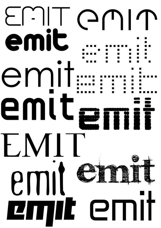
My mood boards really came from these ideas, I had colour schemes for different designs in my head which I proceeded to put into mood board form to see how all the colours work together. See the contrasts they have with each other, which colours are vibrant and pulsating; really trying to mirror the feeling listening to the music gave me. In other words a visual representation of my CD review from yesterday. I also looked at various fonts to go along side my artist and emit and worked some down onto a document, which you will find below this paragraph in a link. These are fonts I really think suit the whole vibe and feel of it, from my perspective; it will be hard narrowing it down to a final 1-2, but I do also have my favourites on the list.
Emit Fonts
I prefer to mood board rather than mind map, it opens my creativity ducts a lot more than simply just writing words down onto paper. Seeing that visual effect the colours and the fonts have in an actual document, then mixing them together to create my desired feeling. I can really see this assignment all coming together. I mentioned it was one I was looking forward to the most to Steve, and I really can't wait to get the go ahead with it. This assignment will really let me use my design skills to their boundaries, then push them beyond the limits and discover new techniques, new ways I'd never really thought of before. I'm hoping to excel with these tasks, I don't think I'm just going to settle for a pass with this one; I need to push this mini-major.
I really enjoyed the CD review yesterday, it did push my creativity in a different direction and working with words in that particular way is something I thoroughly enjoy. Especially as Steve knows, using such a complicated syntax and lexis to convey my ideas to the audience and really try describe exactly what I was feeling and thinking, when listening to the CD. I can't wait to see what the self study work is like.
Tuesday, 11 March 2008
Monday, 10 March 2008
Breathe Aload Of Gas..
With Gas, the first thing hitting you is the overwhelming futuristic flavour that greets the eardrums, says hello.. then warps you at light speed to a distant planet. Finding yourself in a world of eclectic sounds, visions of bright pulsating lights whereeverything is backwards; essentially Tokyo on ecstasy. In this case Gas is more like rocket fuel than petrol.
Comparable to well known artist such as Aphex Twin, Gas is more of an experience than a song; giving you memories, rather than a quick catchy chorus. Presenting an environment for outer space beings to thrive, evolving into watts of living sound. And at the heart of this is 'Wolfgang Voigt' manipulating your mind, body and soul.. as the puppet master controlling his own interstellar universe.
My previous perceptions of ambient/electronic have been seismically thrown out the window. With songs like 'Timestretch~Earthloop' and 'Microscopic' laying the strong foundations for the more eclectic structures like 'Experiments' and 'SeOCl2' to burst through the terrafirma and amaze. Wolf's creations constantly feel like you'd never hear the same song, in the same way twice; every synth, every beat is so exposed to its own interpretation.
Gas offers both the novice and seasoned electronica listener a journey, 'eliminating any interruptions or distractions' on a path to an ambient enlightenment. Do you love music? If you answered yes to that question, buy this.
Wednesday, 5 March 2008
A6 - Evaluation
Personal Overall
Out of all the assignments we have done, it’s hard for me to pick between A5 and A6 for the one I’ve enjoyed the most. There has really been different parts of each that appealed to me a lot. With A6 I think it’s been the timed-tasks, working to a set deadline of an hour or so is something I enjoy; the pressure inspires me to produce better work and on deadline. Sometimes I just need that extra push of a pressured deadline to get something done, especially when I tend to do work and re-do work; causing me problems due to the time restrains. With the timed-tasks, you know there’s that looming deadline and there is no way around it. I wish we would’ve had a little bit more freedom with our designs; working solely with Adobe InDesign is a tiresome objective… especially since I’m really used to using Adobe Photoshop for all my design needs.
Which I got to do when it came time to design our presentation and handouts, I remembered to make this a real design task after the first presentation. Again I continued a theme linked from my presentation to my handout, I made it a real classic design to emphasize the kind of fonts Frederic Goudy created. To do this I used Photoshop to make fading lines for breaking up the text and for details in the corners of the presentation and handouts alike. I felt just this small design feature in my work added some real character without taking precedence before the actual content on both; because of course this is the most important thing.
I was a little unhappy when it came to my actual performance in the presentation, it wasn’t really myself as I’m usually quite comfortable in that environment; as I’ve done presentations hundreds of times. I think outside influences distracted me from producing the performance I actually wanted to when it came to the presentation; I unusually froze up and forgot a lot of the information and script I had memorised for that task. Hopefully I’ll be back to my previous level when it comes to doing another presentation in the future, and definitely in regards with the final task of the course, which is to present all the work you’ve done over the whole course.
Hokai
This task was the one I think I enjoyed most out of all the assignments in A6, because it was so small every detail had to be looked at in close proximity. Sometimes I tend to lose focus on the smaller details when it comes to the bigger tasks and make errors that could’ve easily been avoided or corrected. I was also really happy the turn out of my actual design, I feel it emphasized the brand in the right light and would have worked well as an actual design for this type of product. The information a person looking for this kind of paint would need to take light of; was in there clear and could’ve been seen with accuracy by any passer by. Also with the feedback given by my tutor, he was very happy with the product design also and noted that it is a very workable design. This task follows a methodology that I have had throughout this course, keeping it simple but effective. As I really used to over complicate everything I did when it came to design; now I’ve started to break everything down and go for the simple clean effect.
Vodafone
The Vodafone task, was one I’d of really liked to do out of Adobe InDesign. When I first discovered what this task was I thought it was a real good way to present some serious information with a good layout and arty feel, but due to the restrictions of InDesign I don’t think I managed to achieve this. I previously had picture in my head of graphical features all over the piece, but since we were only allowed to work with the tools given to us and the information given on the assignment sheet; I was a little disappointed with my overall outcome. I think with another 10 or so minutes I could’ve turned this into something really good. At this point I hadn’t fully got to grips with the way precise layouts work and the design features you could include, also the time saving aspects of creating these layouts. If I were to do this again I know I’d produce a far better product, after just the amount of experience I’ve had since creating this one.
Jonathan Gee
I really thought I’d enjoy this task, but I found it quite frustrating. The annoyance that captured me during this task was all down to one point, and that was lining my paragraphs up at the bottom. I was quite happy with the rest of my design; I tried something a bit different with the banner leading down towards the text and next to the picture and especially with the pull out quote; which I also carried onto some of the later assignment tasks. After this task I started to do some real research with Adobe InDesign and used it a lot more, giving me a better knowledge of the software; hopefully something that would push me to improve in the future tasks. Due to this annoyance and also not really paying attention to detail, as I had a typo on my pull quote on the word ‘bad’ and it really hindered the overall look of the piece. Having a typographical error in that way, is not professional at all.
Grid
Today’s Grid task was one that I quite enjoyed also, having previously got quite familiar with in Design; I found this fairly easy and with no time at all was able to create exactly the layout with the margins I wanted. A lot of this was due maths during, breaking down the numbers and working out what each individual cell and space so that all my layout was correct and easy to manage. Due to recent experience with such layouts I definitely think this helped me in the completion of this grid, having sampled other grids from various newspapers and also the ones we did on the Jonathan Gee and Vodafone assignments. The small design tasks in this assignment were easy to produce, I really hit on of my detailed roughs on the head; taking inspiration originally from 'The Guardian' newspaper style for the header. Unfortunately they didn't have the exact font I wanted to use; which was a light thickness Helvetica, which would of suited the theme of 'Jazz' but with a real modern and formal twist. Though I finally settled on Century Gothic is a nice compromise as it suited the feel of the font I was originally going to go for.
Story
Due to the grid and everything being set out in the last assignment this was a fairly easy one to take hold off. After a few rough sketches of layouts, followed by some more detailed versions, I managed to get a layout I really liked. It incorporated the picture as well as a good pull out quote to really draw the reader in. Unlike some previous assignments when it came to using the grid I didn't find that many problems, knowing exactly what I wanted and where to put it. I think this planning helped me so well when it came to these final stages of this part of the Grid/Story assignments. I did have a slight problem when it came to the website address running onto another line. But due to the fact I've recently become more fluent in the language of 'Adobe InDesign', I found a good solution for this by making it slightly smaller but bold, so the website address really stood out to you. A part of this assignment I really enjoyed was the creating the headline, I like being creative in all different ways so this was just another outlet. I toyed with various headlines, using wordplay on snake's names, popular films such as 'Snakes on a Soul Plane', even though Jazz isn't exactly Soul. But I was very happy with the one I finally chose.
Improve
Be alot more adventurous when it comes to the actual designs, adding new and unused elements to really push my designing forward. And attain the next level.
Get used to the programs and applications I will be using to do the tasks, alot more first before starting the tasks. Instead of learning them through the process of working.
Subscribe to:
Posts (Atom)
