An intense mood captured the group today as Steve set us the task of doing a certain amount of banners in a certain amount of time; surveying the group I saw some people really struggling to come to terms with doing these banners at such a fast rate, whereas other's coped well and looked relaxed throughout. But for me it wasn't about the amount of designs created it was about the quality, though I did manage to meet the small deadline nearly every time.. bar the last deadline; 4 banners in 30seconds? (This is definitely more like what I expected from the course)
The whole development of today, from those small sketches at the beginning then stepping up to the neater more precise sketches was quite an enjoy time, I think one of the things I like most in design is developing ideas into actual pieces and then seeing how they work in the terms of the web. Though I have to profess to being a bit of a digital designer and prefer to do everything in Photoshop rather than messing around with sketchpads; even when I can see the benefits of all the development plans on paper.
I've created a few banners, I'm 50/50 about these.. not really sure if I do actually like them that much, working at college on Photoshop is frustrating, as there's not the amount of tools open to me like when I work from home. I'll post these few banners to see what you think..
Referral feedback yesterday, what a tough start to a morning going through references over and over again, but it did really help me with the process, I now know how to reference properly and more effectively which will mean good things for the current A3 assignment. The results of the referral feedback where that I passed the main part, but failed the Historical part due to the fact I didn't put the publisher's name down on the book references. Quite frustrating as Steve said the rest of my references were fine and acceptable, but hopefully I will be able to make up for this during the A3 assignment.
Speaking of A3 it is progressing quite well and I've kept track with everything and made sure that my organisation skills this time around were top notch, all time sheets done on time, various points in which I create a micro checklist to see exactly where I am at & also what I have to do, alongside the 'Production Schedule' done firstly. With the over view of this, I have stayed working on a steady track and not really fluxed with weeks where a lot of work gets done, then a week where not al to does. This is turning me into a more hire-able person and shows that I am able to work well in these deadline situations and plan my time out effectively.
Also the Photo Restoration work is now finished, I will be uploading the before and after onto my blog later this week for you all to see. Personally I feel that I've done a good job on it, and people I have shown this to have said it's good; usually commenting on a good use of colours and colourscheme with the right amount of contrast/brightness in an effort to look like the real thing.
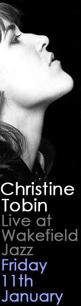
Banner 1 - http://i2.photobucket.com/albums/y24/seyance/Web-Banner-1.jpg
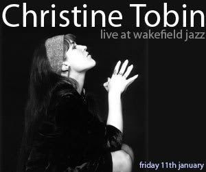
Banner 2 - http://i2.photobucket.com/albums/y24/seyance/Web-Banner2.jpg
Nothing final, just a testing a few things out.
Subscribe to:
Post Comments (Atom)

8 comments:
It's nice to hear that you enjoyed the intense banner task on Tuesday. As Steve was saying, if you enjoyed that task then you have the means to be a designer!
4 banners in 30 seconds? Easy.
I like what you've done with the banners, but I think you've put all the type to hard up against the sides of the banners. There's not much room for them to breathe, so if you're going to go with these ideas I'd suggest that you shrink the type down a bit which will allow you more space around your design.
In the first one the placement of the image and where she is looking to leads your eyes away from the text that the people are meant to be reading. If you're going to go for this idea I'd suggest you put her head at the bottom and the text above so if people look at the image they're eyeline would naturally rise to the text.
You're breaking the flow by having her looking away from the text.
I also enjoyed the task on Tuesday, and I was quite surprised I did! I found it quite satisfying to see work progress in such a short amount of time- and to be, in my opinion, to an acceptable standard.
In terms of your banners, I agree with what Craig said... and I think you need to get away from using the same font/style all the time... I wouldn't say it's particularly 'jazzy'!
Also, I just wanted to remind you that you have to use a different pic/details for your skyscraper and medium rectangle banner!
I also enjoyed the banner design task on Tuesday; well I did after the first design time limit. Because for the first 5 minutes I didn’t really feel I could do it, but after I proved to myself I could, I really had fun.
Banner Feedback;
I really like the text in design 1, it looks contemporary but has a 'jazz' feel with the use of the blue. However, I agree with Craig that it's not quite working with the image. I'd try another image altogether, that way it meets the brief too.
I think the image works a lot better in design 2. The image and text work in unity and flow between each other. I'm not too sure about the date at the bottom though? maybe have a play around with the spacing between the text.
I'd appreciate your feedback on my screen design.
Thanks!
I agree with Craig the text is too tight to the edges. Perhaps shrinking the font size will help a bit more with this. You have to remember this might be close to another element and may clash.
Personally when I look at the picture of her I find myself tracing the edge of her face down to her neck.. and down beyond. Which is why I decided to put my text below, so that it would follow on from where my eyes were going.
I tried to seperate the text up with the colours, as I thought it might appear sloppy with a change in font size, and overall I achieved the look I wanted to, contempary.
Thanks for the comments.
Comment deadline.
Post a Comment