I will not be rushing to get it finished, this maybe because I have timed managed effectively enough to allow me the final week be relaxed with my work. All the preparations in my sketch book to give me the necessary information ready at hand to complete my mini-tasks in the assignment quickly and to the best of my capability, has helped with this a great deal.
When first properly learning about Adobe Pagemaker this week, I found it to be an awfully complex programme for the job it was actually doing; it basically incorporates a few lines here & there, but the simple factor that you can't move lines along a pixel at a time greatly hinder it's usage.
I told Steve of my problems with Pagemaker, in our tutor meeting today; in which we agreed due to my history and experience it might be best for me to move on to using Adobe InDesign. Which would allow me to create what I wanted, more coherently than before and quicker.
Yesterday in a meeting with John we decided that I would set a few goals with my weekly blog entries, as this would give me some concrete things for me to work towards & hopefully get the best out of my self study time.
- Get familiar with Adobe InDesign / Create my finished screen design with it.
- Collect & organise my references; to help me to add them quickly at the end.
- Include & annotate some more inspiration work in my sketch book.
- Do everything with micro tasks, enabling me to get into intricate details.
- Push for at least a merit; marks that will show my actual capabilities.
- Finish it.
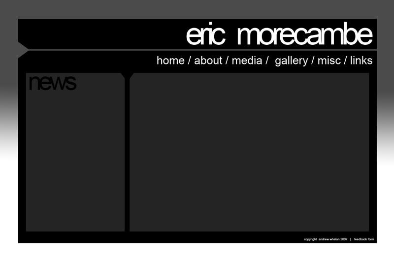
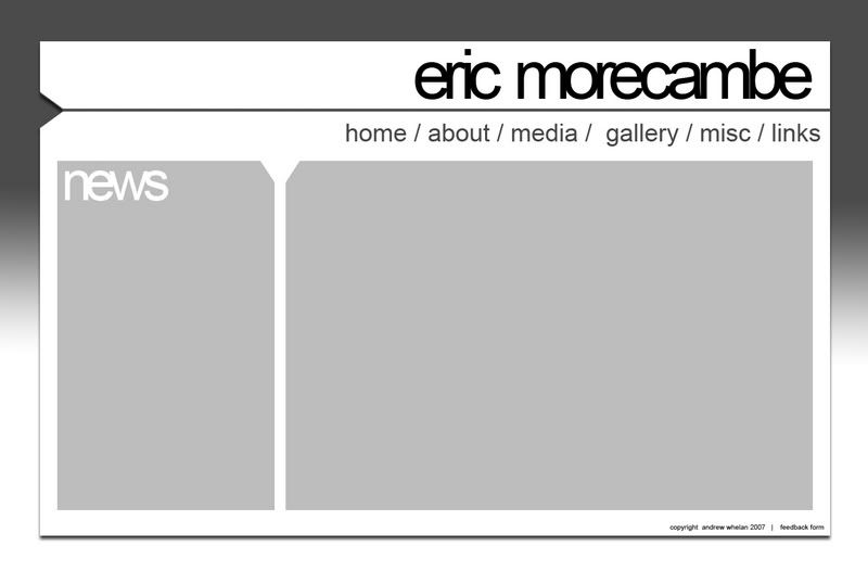
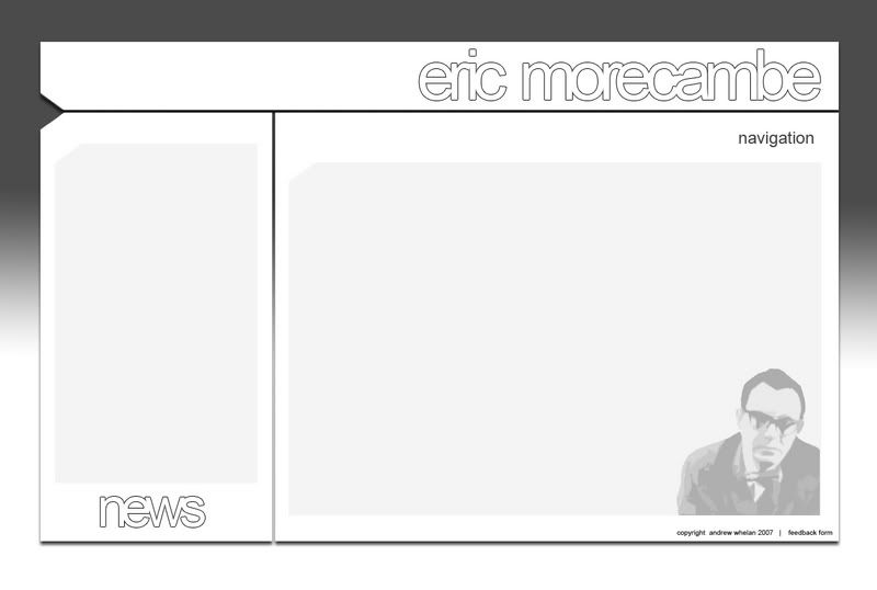
I've done some nearly finished screen designs, hopefully this will give you the idea of the target market and shed some light on the kind of look/layout I'm trying to achieve.
http://i2.photobucket.com/albums/y24/seyance/ericsite.jpg - White on Black
http://i2.photobucket.com/albums/y24/seyance/whiteeric.jpg - Black on White
http://i2.photobucket.com/albums/y24/seyance/littleeric.jpg - Grey on White
Feedback on these would be appreciated..

8 comments:
Who is your target audience?
The target audience I have in mind for Eric lovers wouldn't like that design too much.
If you've set your target audience as young then I think it fits that audience perfectly.
Yeah my target audience is young people, i'm trying to bring a classic comedian to the new-younger generation.
Thanks for the feedback.
Those designs are really good and defiantly suit your target audience.
Nice design. I did, like Craig, wonder about the target audience but the fact it's for younger people does make the design applicable for the target audience. I personally like the white on black one, but as Steve is your 'client', I'd recommend you go for one of the others, perhaps the black on white would be your best bet.
I still think that the grey on white is the most effective, contemporary and swish! I also approve of the graphic in the bottom right hand corner, good consistency in style.
Whether or not Steve will approve of this I don't know?! Make sure you have good justification for all of your design decisions and it is documneted in your sketch book.
I'm impressed keep up the good work!
Well done on your designs there really good, personally I like design 3.
I really like the third design and I feel that it suitable for your target audience.
I do think that the link for the feedback form is a little to small and hard to find. I think it would be better incorporated into the main navigation.
I also think that the third design will allow you a large amount of contrast with the text and the background.
When it comes to producing one for handing in, make sure you include all the measurements. Also, I would advise that you put some Lorem Ipsum text onto it, to show where the information will go. Also state the sizes this text will be on the website.
Steve will be looking for these kind of things, as they show you have thought about the technical requirements for the site and not just the aesthetics.
Post a Comment