This has been a good week for me, certainly at top 5 contender for the most enjoyable few days. I think this has been mainly due to the atmosphere within the group, it's become such a more relaxed enviroment to work in; humour inspires design in my books. And all this even without the usual Comedic stylings of Shaun Bellis for the past few days. Alot of the enjoyment as been down to the work we are currently doing, it's things that I really enjoy; building websites and making graphics, perfect combination to work in a harmonious fashion with the groups attitude. I think that alot of the students in the class are also improving at such a clearly vast rate, they can see the difference in their own work, when comparing it to ones of an earlier nature. Especially evident when the knell of the 'dreaded' timed task arrives. Well, I say dreaded in an obviously loose nature as everyone now seems to actually enjoy these timed tasks, not just myself and a select few. Work is handed in 3/4 of the way through the time limit, there's more interaction with Steve, more feedback given to eachother and everything is time planned exceptionally. They say time flies fast when your having fun and we really seem to jet our way through them at the moment.
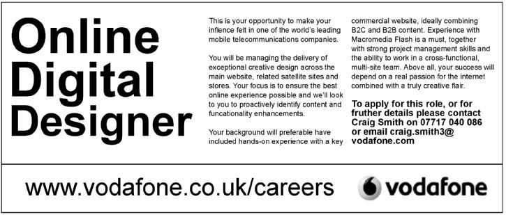
Today's timed task was to create an advertising banner for 'Vodafone', including the logo and a set advertising content matter. As soon as I heard about this task, my mind raced with vuluptuous amounts of design idea's and ways to present my information. I first settled my heart on a tall-thin banner, thinking that this would enable me to present this information in a very well set out and professional manner. But when it actually came to working on the sizes of banners, a long thin one really caught my eye; I preceded to use that one, creating various different designs to encapsulate the look and feel I was going for. My main target was content, I knew there was no need for obscurely flashy designs. I kept it real simple, thoughtfully managing my white space with subtle design features and manipulating the content to best convey the serious but light hearted nature I wanted to put across. Juxtaposing idea's maybe, but I felt it necessary to project both to the reader with my piece. Due to the restraints of the college computers, I wasn't ecstatic about my particular design, but I still felt it put across the message I was vying for in the right manner.
Any feedback would be grateful - http://i2.photobucket.com/albums/y24/seyance/vodafonejpeg.jpg
After a bit of a lull in my design hunger, I can feel it is nearly restored to it's former glory.. if not a little stronger, both in class and out. I'm really starting to love designing again, and if only my computer at home would stop being a virtum vial of annoyance, I'd be able to get on with this alot more.
My aims for this week are to fully finish most of the inns and outs of my website, including the form and validation. I think in the past I've left things to the last minute a little too often and this has hindered my performance on the course, and led me to not actually reach my potential with the design sides of it. Luckily I have been able to rectify this somewhat in the referral process, but I'm eager to pull myself from the dark, foggy depths of the referral process. Onto the nicely paved road to success and passing everytime. Not only will this stand me in good stead for the rest of this year, but will also be a good catapult for next year and the work that is to come for me, inside and outside college. Hopefully I've found the right sum to push me into this place.
Subscribe to:
Post Comments (Atom)

6 comments:
You've not added the link.
Spelling mistake - "Fruther details"
I assume that this is the same task as we had last year, if it is not I'm sure Steve will correct me on any of the details.
I feel that your choice to use the entire 1st column (of this 3 column grid design) for the title of the piece has compromised the rest of the design. I think the body text is a little on the small side, and could have been made bigger if a different solution for the title had been found.
The leading on the last paragraph also could do with changing, as is is not large enough. It looks like a Designers Republic advert, which I don't think is suitable for this client.
The separation of the URL and logo at the bottom is nicely spaced, and would be suitable to use as a template for other job adverts, which would be a smart way for an agency to do consistent work if it were for real.
One book I can recommend to show you both layout and typographic techniques is the " Getting It Right with Type: The Do's and Don'ts of Typography" which I found very useful. It's about a tenner on amazon.
One final note, is your blog title appropriate? I'd bet a few pennies on Steve emailing for a change soon...
Once again a nice flowing entry which seems to summarise the feelings in camp!
In terms of your Vodafone ad I think it works well and I definitely appreciate your boldness with your use of the typography for the job title.
Creating originality by only manipulating the typography is a difficult task but I think you've pulled it off. It would certainly stand out from other ads.
I think a few tweeks could improve it further, i.e making sure the website address is aligned to the text above. Equally the breaking of the third paragraph over two columns is slightly uncomfortable for me.
Hi Andy
Sounds like I have missed out on a fantastic week.
Another very descriptive and informative journal post.
The break in the third paragraph might be ok if the advert was for a factory worker or similar, however as it is for a design job, I do not think it works.
The details for application in bold is a good idea.
I am not sure if it is just my eyes but is there a variety of text sizes on the "Online Digital Designer" part?
Julian’s keen eye has rightly spotted a spelling mistake, I can see now what Steve means about the importance of SPG as in my opinion it lets the whole thing down.
--
Shaun Bellis
Just like you I settled my mind on a tall thin banner after drawing some initial designs in different sizes. Personally, I think the thin narrow ones (whether lengthways or widthways) work the best.
Apart from the spelling mistake, your design does the job its intended for. Good work!
Post a Comment